I often go into the process of designing my bullet journal spreads with the intention of keeping things simple. But I have a tendency to complicate things, so simplicity is tricky. Achieving simplicity can sometimes mean making something complicated, then paring it down. Which just ends up being more work, to be honest.
But this month I stuck with a simple design that I set up relatively quickly. I was inspired by a video from art and bujos, who used a gingham pattern for her picnic theme.
As soon as I doodled gingham in my bujo, I knew I wanted to use it. It just made me smile, and I can’t tell you why. Connections to childhood perhaps? My grandmother made me a red gingham skirt with white embroidery when I was young. It was beautiful and swirly and fun.
Whatever the reason, my simple pages in pastel colors are making me smile this month. Hope something in your life is making you smile!
Cover
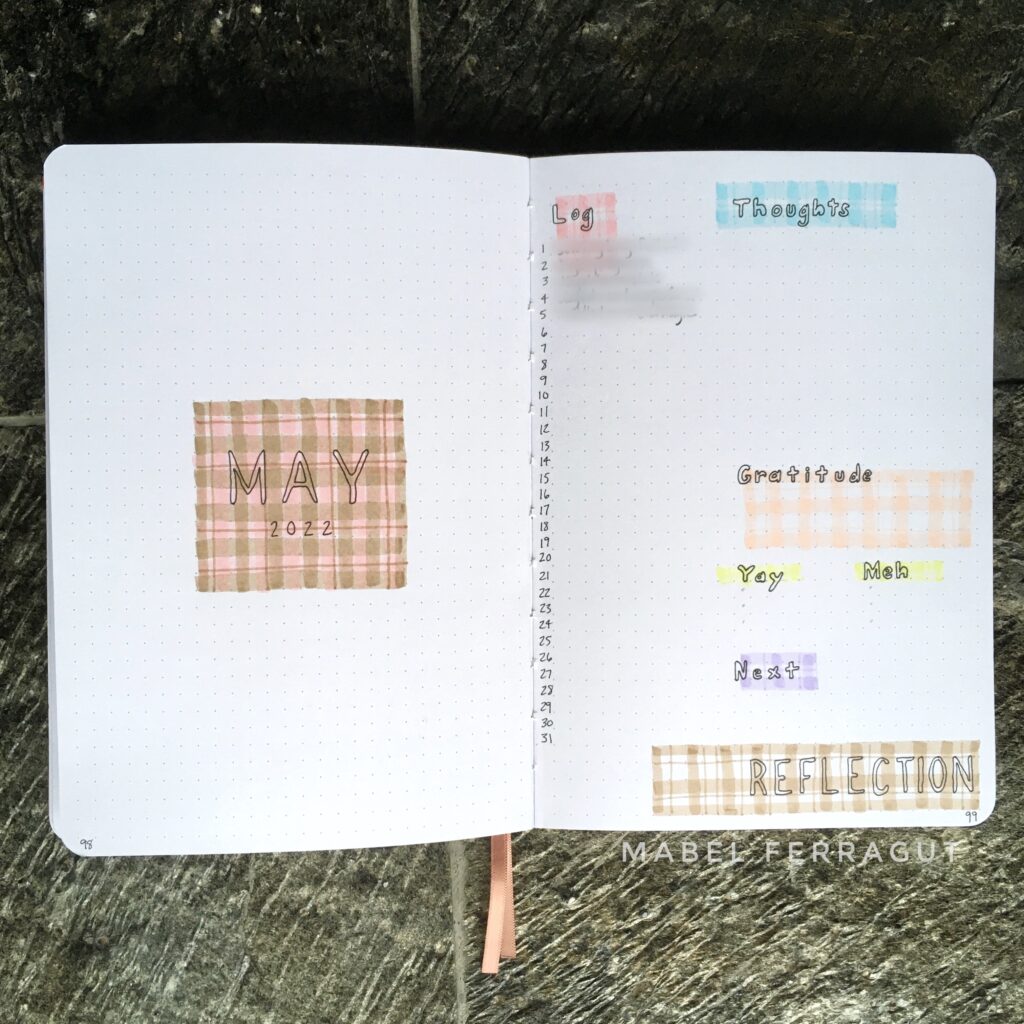
My May cover uses two colors for a more weighty gingham. One square of gingham for the title keeps things simple.
Next to the cover is a May log and reflection page.
Projects
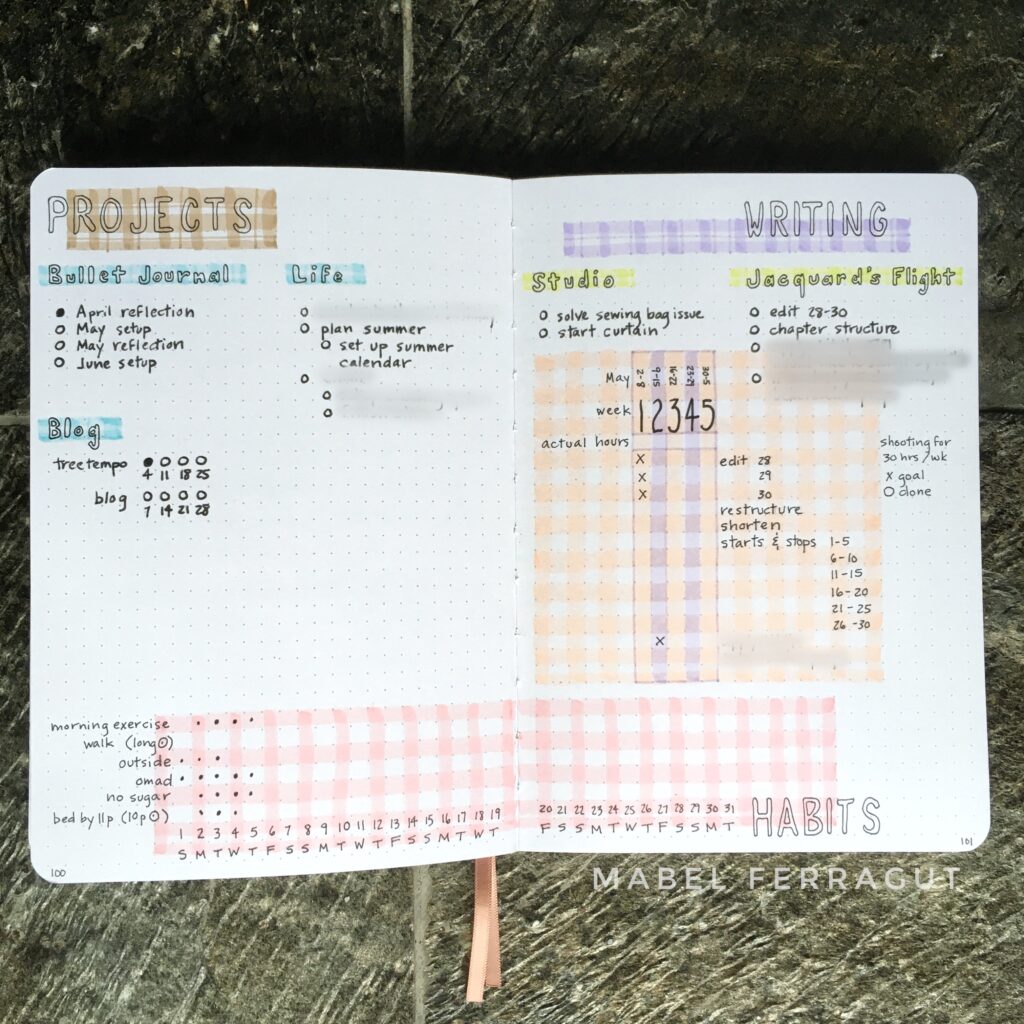
I combined projects and trackers into one spread this month. My habit tracker is at the bottom in pink. I grouped a writing tracker with the my list of writing projects on the right.
Calendar
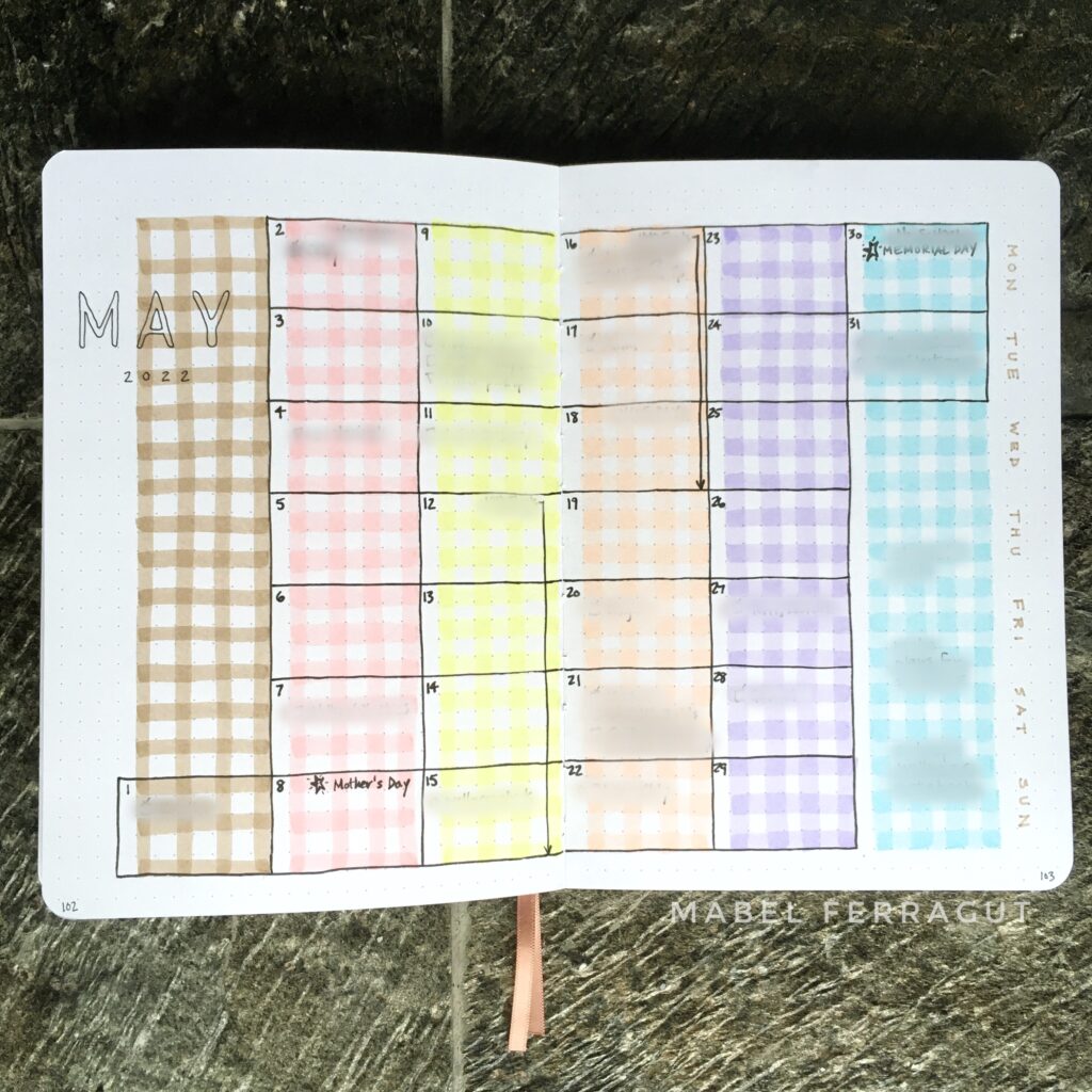
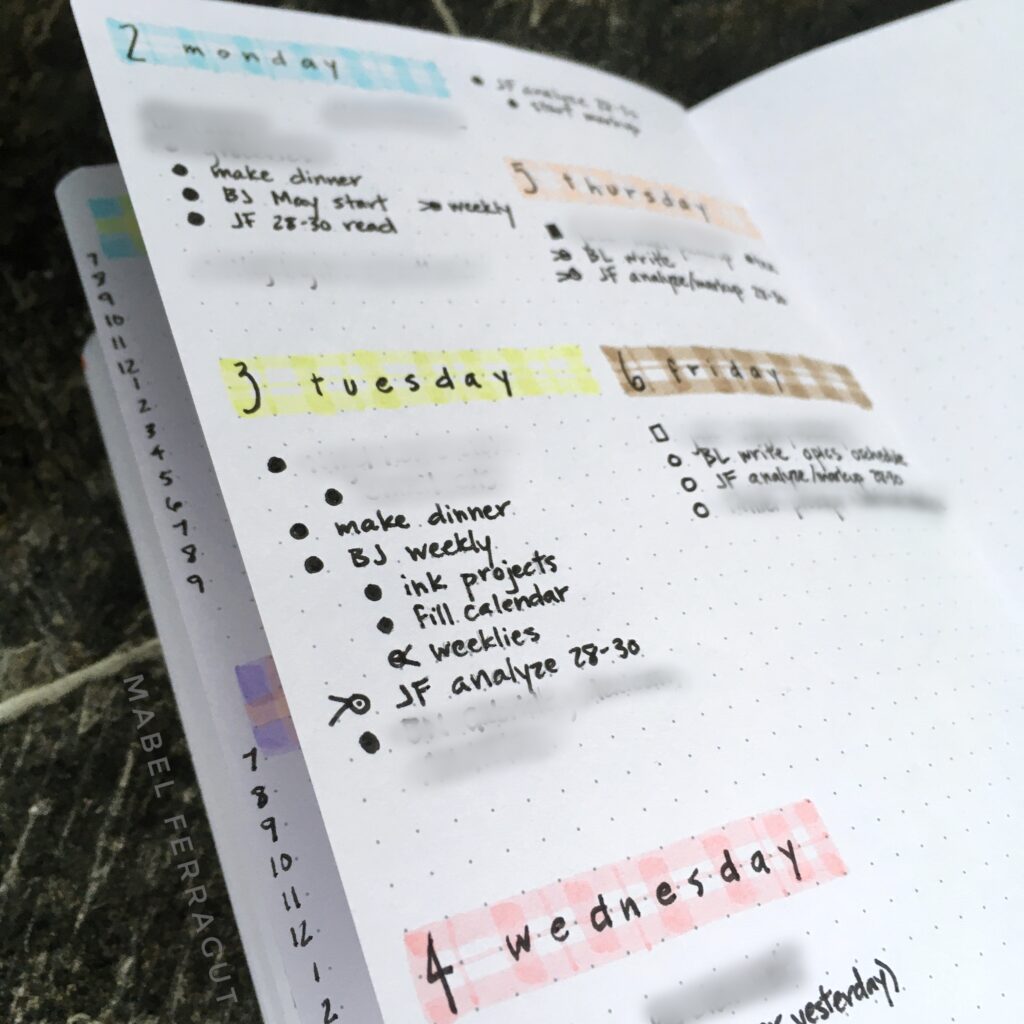
Simple, simple, simple. Each vertical week gets a different color of gingham.
Weekly and Dailies
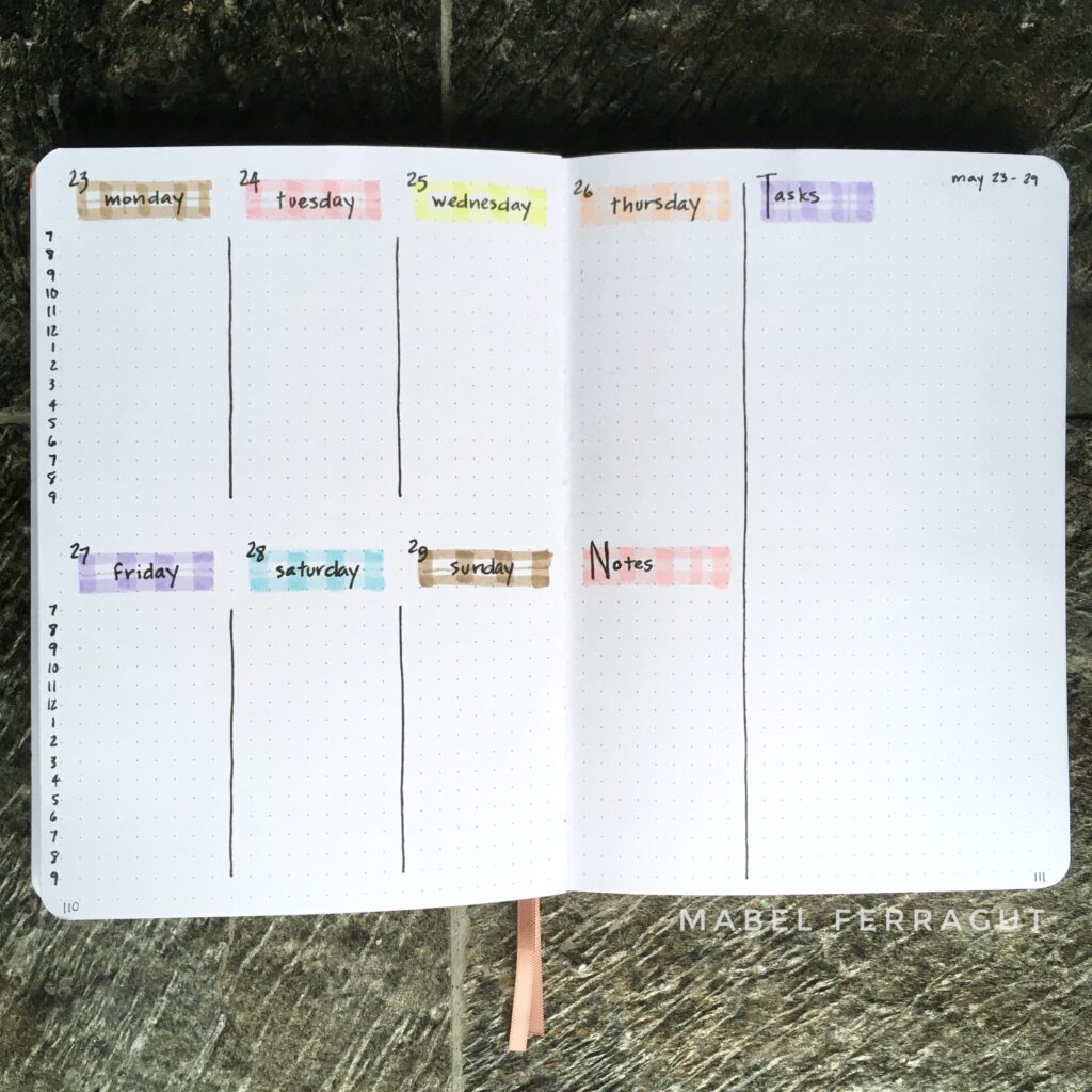
More gingham rectangles to round out the spreads.
How do you feel about gingham?

