I had so much fun setting up my December spreads this month! I always enjoy setting up spreads, but last month I needed to get to editing my manuscript, so I focused on efficiency. It made the setup less satisfying, which was fine for November. It worked. Now I’m easing up on my writing schedule, so I’ve allowed myself more time to doodle.
After the riot of purple in November’s setup, I was in the mood for neutral colors. When I saw Anna Landeen’s December 2021 Plan With Me video, I fell in love with her snowy village and her color palette. She has an amazing sense of color.
Adaptation
Using her cover as inspiration, my challenge was to adapt her beautiful watercolor paintings to a simplified layout rendered with markers. I studied her cover design—especially the color palette—as well as the design she used for her Focus and Brain Dump pages. For the sake of simplicity, I sketched out a village with all the buildings facing forward.
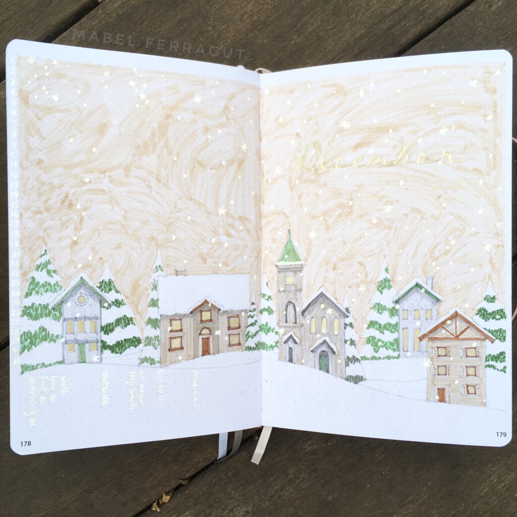
In order to get the effect of snow on trees that Anna created using watercolors and gouache paint, I decided to use almost the opposite of her technique. Gouache paint is fairly opaque, allowing you to build up color, even white on dark. Markers don’t work that way. So I sketched out my trees lightly in pencil, including lines to indicate sections of snow. Then I used a couple shades of green to color in the areas of the trees that were not covered in snow. In places where the snow met a white background, I outlined with pale gray. Then I erased the pencil lines. The effect of using negative space to imply snow worked beautifully, and it was fairly quick to draw. :o)
To make my neutral palette a little more festive, I incorporated gold. In addition to writing the title in gold, I lit the windows in my town by using gold to fill them in.
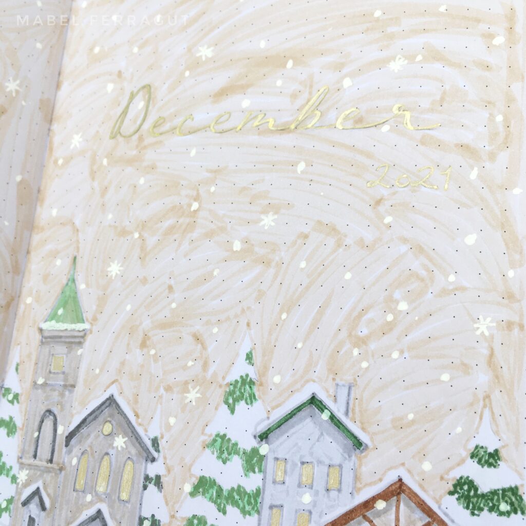
Cover
I love incorporating habit trackers into my cover page. I used to have a separate spread for them, but without a functional element on my cover, I found that I rarely went to it. So much time spent on a spread that had no real function seemed a waste. Now that I incorporate my trackers, I use my cover every day.
For December, the challenge was to incorporate habit trackers without marring the peaceful scene. It took me some time to figure out how to do this. The falling snow seemed like the perfect cover for completion marks, but I needed to label days and habits. I hated the idea of black writing anywhere on the page.
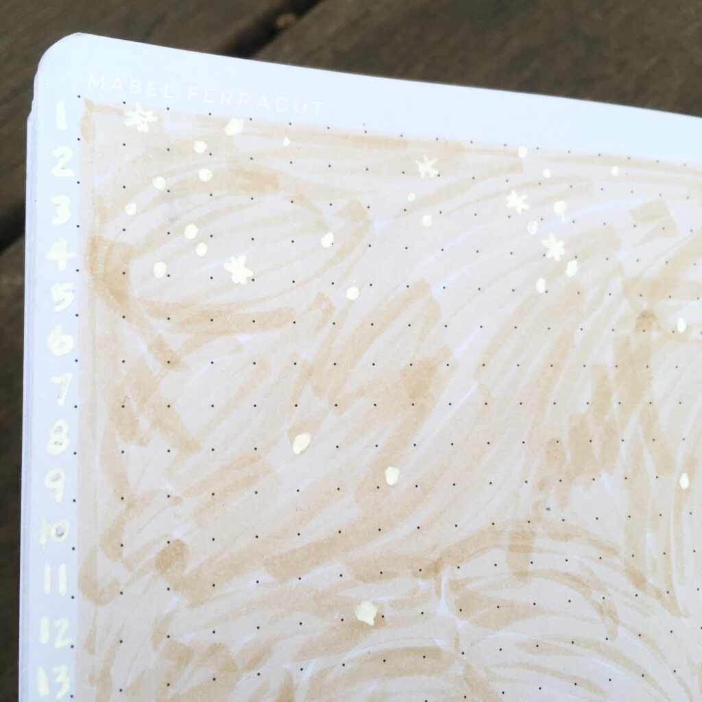
When I realized that my white pen was visible on white paper, though it blends really well, I decided to use this to my advantage. I used my white pen to list the days of the month at the left edge of the page, outside the drawing. Then I chose columns for each of the habits. To prevent large blank spaces, I spread out the columns in various groupings. At the bottom of the page, on the snowy ground, I labeled each habit in white.
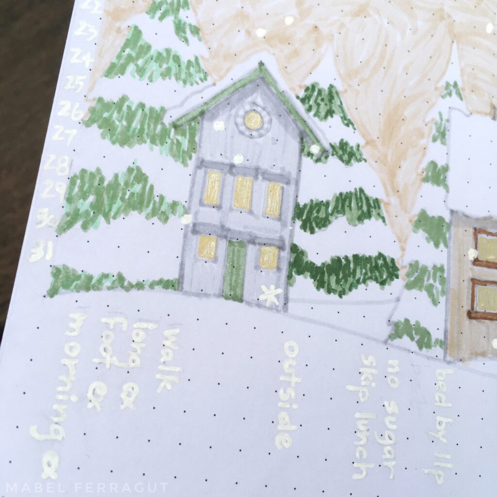
Each time I complete a habit, I add a snowflake inside the corresponding box. I vary the snowflake’s placement within the box, as well as its size and shape, to keep the natural look of snow falling. This habit tracker doesn’t give me an immediate visual sense of how well I’m sticking with my goals, but the information is there. I’m happy to trade clarity for beauty this month :o)
Calendar
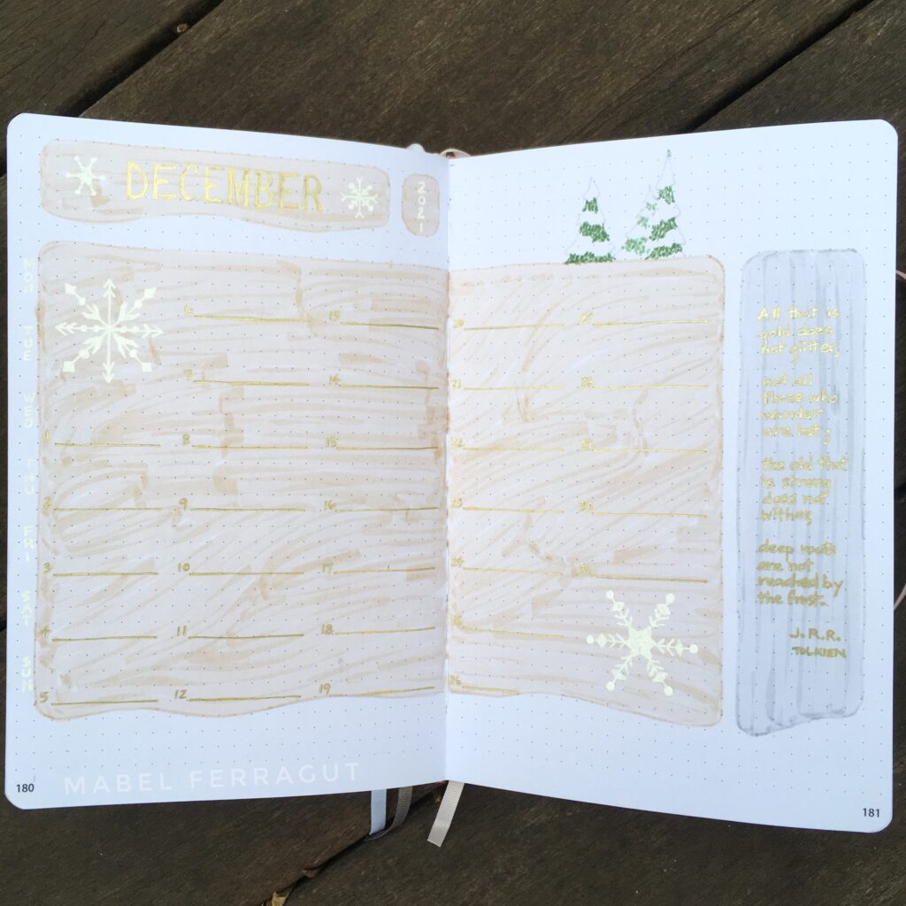
I kept the calendar simple, using curved lines to imply drifting snow, and adding a few trees at the top. The Tolkien quote is comforting as winter intensifies.
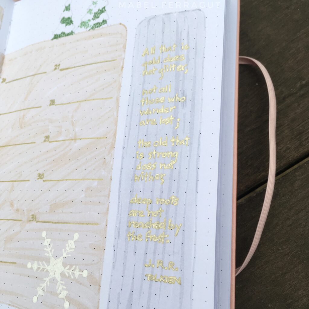
All that is gold does not glitter,
not all those who wander are lost;
the old that is strong does not wither,
deep roots are not reached by the frost.
J. R. R. Tolkien
Projects
I’m trying something new on my Projects spread this month. This is a continuation of my experiment with Sarra Cannon’s task blocks technique. I found it incredibly helpful during NaNoWriMo, for which I created a dedicated tracking page. (You can see that here.)
Because NaNo is intense, I did a lot of sprints to keep me on track. I don’t plan to sprint through December in the same way, but breaking down my days into half-hour blocks is illuminating. I get a more realistic sense of how much time I actually have, and can see where there’s room to push harder if I have to.
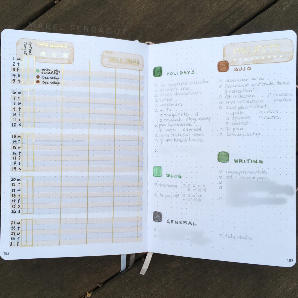
On the right side of the spread, I listed all my tasks, grouping them into color coded categories. This isn’t too different from my normal Projects layout.
On the left side, I listed the days of the month. Each row represents a different day. Each day has space to record a target number of task blocks, the actual number of task blocks I worked on my projects, and four columns to plan which tasks I’ll do that day.
At the beginning of each week, I decide which tasks (on the right side) I want to accomplish. Using the task blocks available each day, I distribute my tasks into the chart on the left side. This is such a powerful tool, connecting big picture goals (projects, goals and tasks) with daily plans.
Calm
Because of the subtle colors and metallic gold, I’m not sure the pictures do these spreads justice. But I am thoroughly enjoying opening my bullet journal to these peaceful, festive pages each day.
Hope you are enjoying your December days.

I Love Your Visual Art So Much!! And it inspires me. I just buy a planner (Tools4Wisdom) but then modify some pages. I put in a thing a couple of nights ago, lists of what I want to get to multiple times a week, and wasn’t sure what it was but was pretty sure you inspired it. Yes! I have my 1/2Dec&Jan “habit tracker” set up. Satisfying — those dots next to all my life goals. Always learning from you…
So glad you’re excited about your plans. It’s crazy how good it can feel to draw in a dot, isn’t it?