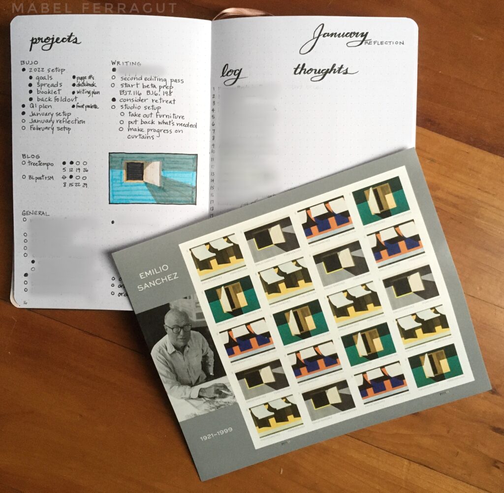
Do you ever find yourself drawn to something—an object or a work of art or a person—without understanding why the draw is so strong? When I went to the post office earlier this month, I had this happen. I went to mail some international letters, but needed to restock our regular supply of stamps too. One particular stamp in the display drew my eye: a painted open window with deep shadows. I found it compelling—something about the simplicity of the composition, combined with the dramatic shadows and light.
When I got home and Googled the artist, my pulse quickened. Emilio Sanchez was Cuban-American. Am I drawn to his art because we have roots on the same island? Or because this phase of his work focused on architectural elements (and I’ve worked as an architect)? Or because his sense of light tastes of the tropics? I really couldn’t say. There’s just a gestalt in these paintings that I connect with.
Unexpected connections like this are one of the things that make life delicious. I don’t need to break it down further than that really. The mystery is delightful.
January Spreads
I spent a couple weeks setting up my new bullet journal (more on those spreads in a future post). Overkill perhaps, but this included reviewing 2021 and planning for 2022. I wanted January to have its own flavor, but couldn’t decide what that would be…until I came across the Emilio Sanchez stamps.
I found images of more of his paintings, including one of an orange beach cottage with deep pink shutters—one of my favorite color combinations. You’ll notice I didn’t use that combination in my color scheme. I considered it, but it didn’t feel quite right for January. Plus I don’t have a marker that is quite the right shade.
But I couldn’t get that cottage out of my head. So I used it as inspiration for my calendar spread. I’m changing up my monthly spreads this year. Because my new bullet journal only has 176 pages (the fewest pages of any bullet journal I’ve used), I’m reducing my regular monthly pages from seven to four. So no more cover.
I’m a little sad about this, because once I added trackers to my covers, I enjoyed them tremendously. On the other hand, illustrating a full cover spread every month could take a lot of time. Now my calendar will serve as my cover. At least that’s how I set it up this month. I’ll be experimenting with different layouts over the course of the year.
Calendar
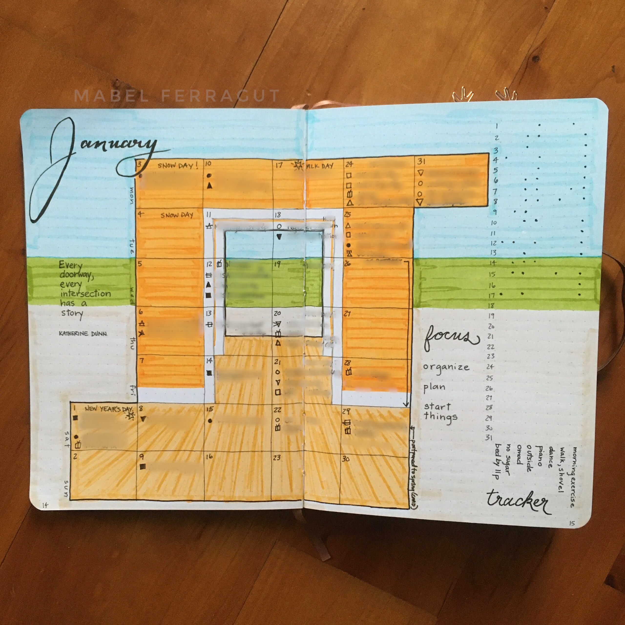
So my calendar takes the idea of a beach cottage and abstracts it. The calendar itself is a cottage fragment with orange walls and wood floor, while the background depicts the beach, ocean and sky. My trackers are on the right.
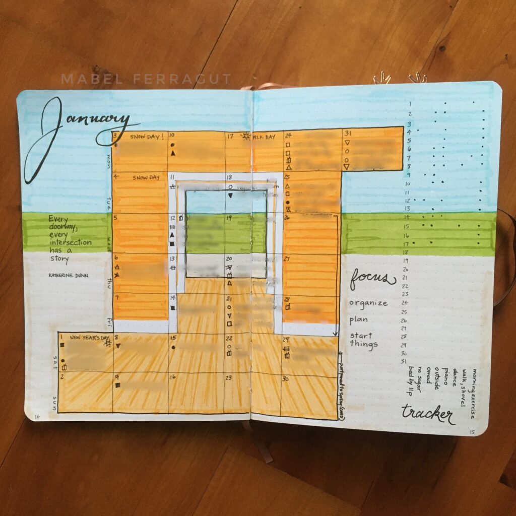
I have mixed feelings about how this turned out. I like the way it looks from a distance, but I will admit that there are parts of the calendar that are confusing to write in because of the crisscrossing lines.
I love the opening in the center though. It feels like a doorway into a new year. Overall, I’m enjoying the calendar. It’s fun to try something different.
Projects
Projects have been condensed to one page and paired with my monthly Reflection. Taking inspiration from one of the stamps, I created an accent on the Projects page—an open window with more color than the original painting.
Reflection
The Reflection page, which used to be at the end of the month, is now in the front. This is partly to reduce how many pages I use each month. But I also like the idea of having it right next to Projects so I can get a fuller picture of the month.
Ryder Carroll answers questions on Instagram every month, and I was inspired by something he said to change my Reflection page. He said that lately he’s been using his monthly log as a place to record the most important thing (good or bad) that happens each day. I need an overview of the upcoming month (hence my calendar spread), but I like the idea of having a record of important happenings. So I added a log to the Reflection page, and I’ve been filling it in each day during my daily reflection.
Instead of a gratitude page for the year, I’m including a space for gratitude on each month’s Reflection page. There are also spaces for Thoughts, Successes, Struggles, and Next. These are pencilled in for now so I can adjust them if I need to.
Weeklies and Dailies
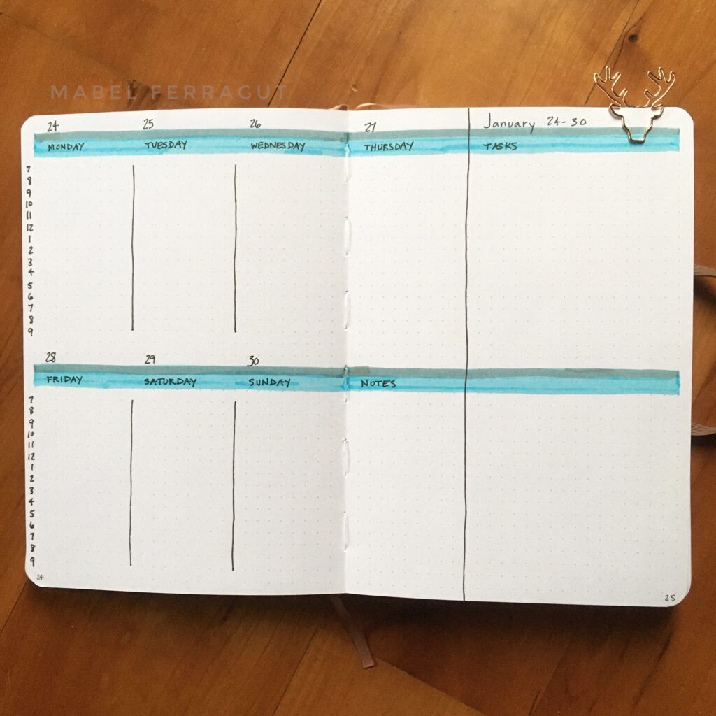
For this weekly I used shades of blue that cross from edge to edge, for a hint of ocean.
In this weekly, each window marks a new day.
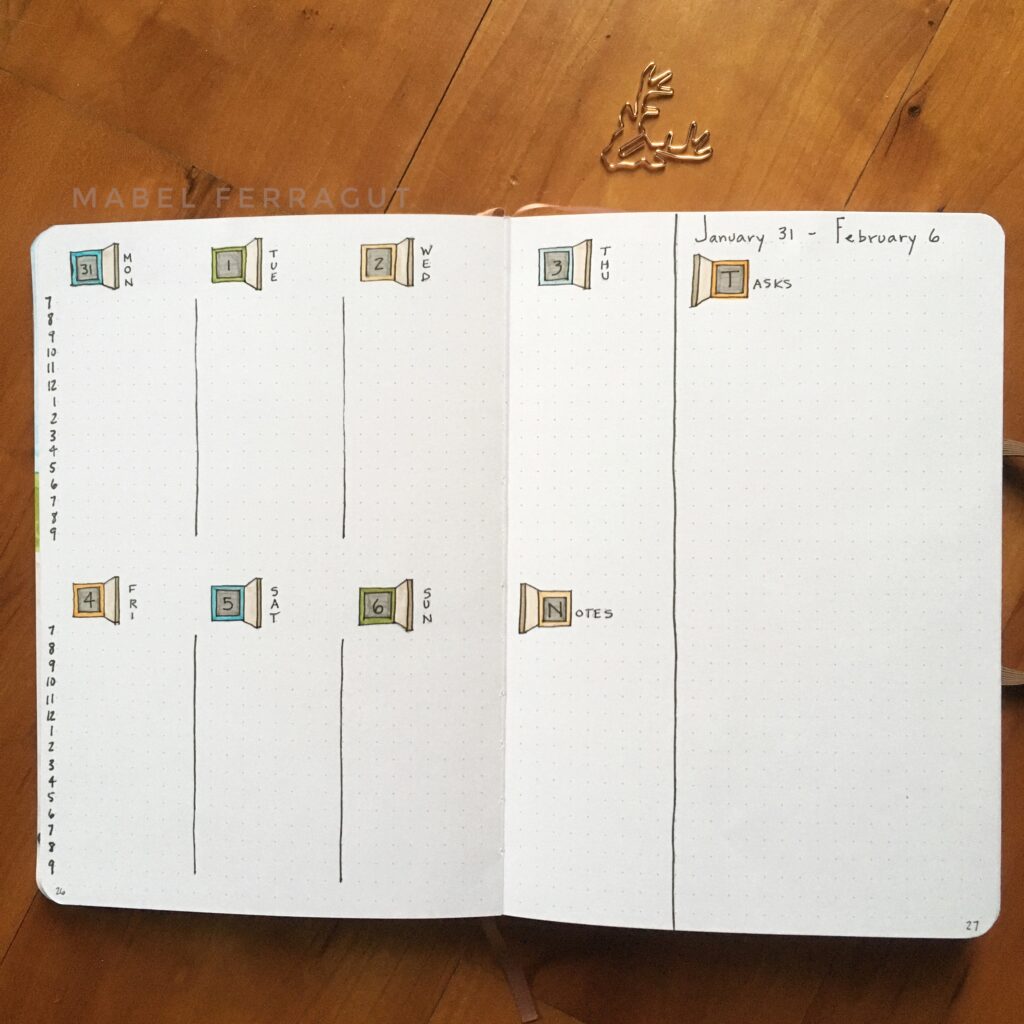
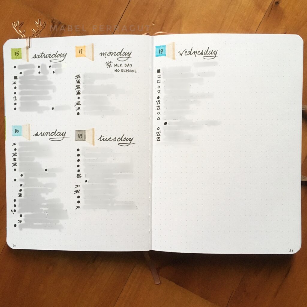
The dailies have a simple setup. A different color square each day, with a shutter in a neutral sand color. It’s surprisingly quick to set up, and I love the way the open window hints at possibilities and new starts.
Doorway
I was drawn to Sanchez’ art when I saw it in the post office. And now, inspired by his art, I feel drawn into the next year by the doorway at the center of my January calendar. I like the forward momentum.
Here’s wishing you forward momentum and inspiration!
And if you find yourself drawn to something these days, tell me about it in the comments…
